← Year 5 art worksheets

Year 5 Lettering: graphic design worksheet

“The Art of Letters” is free to print, with no account. It is the first sheet in the Year 5 art unit “Lettering: graphic design”, for children aged 9 to 10, and takes about 20 minutes.

Print it on A4. The child's pages come first; the answers, and what each wrong answer tells you, are on the grown-up page that follows. Weeks 1 to 3 of the year, 6 sheets in the unit.

Free sample · answers on the last page

The Art of Letters

Name: ____________ · Date: ____________
Year 5 · Art & design · about 20 minutes
Answers are on the grown-up page

Today I can say how the look of letters changes the feeling of a word.

A Look back3 min

  1. 1.

    Mix red paint and yellow paint. Which colour do you get? Circle it.

    redyellow
    orangepurplegreen
  2. 2.

    Which word means how light or dark a colour is? Circle it.

    lightestdarkest
    tonetexturepattern
  3. 3.

    What is the name of this shape? Circle it.

    trianglesquarecircle

B Watch me, then you4 min

Sam is making a shop sign. He can use black letters or pale letters on a white board. Which choice will be easier to read from across the road?

Watch me
blackwhite

Black and white are very far apart in tone.

That is a strong contrast, so the letters stand out.

Black letters on a white board are easy to read from far away.

Now you
  1. 1.

    Yellow letters are on a white sign. Is the contrast strong or weak? Circle it.

    yellowwhite
    strong contrastweak contrast

C Your turn6 min

Look at the two colours in each picture. Strong contrast makes letters stand out and feel bold. Weak contrast makes them blend in and feel soft.

  1. 1.

    Black letters are on a yellow sign. Strong or weak contrast? Circle it.

    blackyellow
    strong contrastweak contrast
  2. 2.

    Pink letters are on a white sign. Strong or weak contrast? Circle it.

    pinkwhite
    strong contrastweak contrast
  3. 3.

    Blue letters are on a yellow sign. Strong or weak contrast? Circle it.

    blueyellow
    strong contrastweak contrast
  4. 4.

    Grey letters are on a white sign. Strong or weak contrast? Circle it.

    greywhite
    strong contrastweak contrast

Say it out loud: Which pair was hardest to judge? Would a bold sign or a soft sign suit a quiet library, and why?

D Spot the mistake3 min
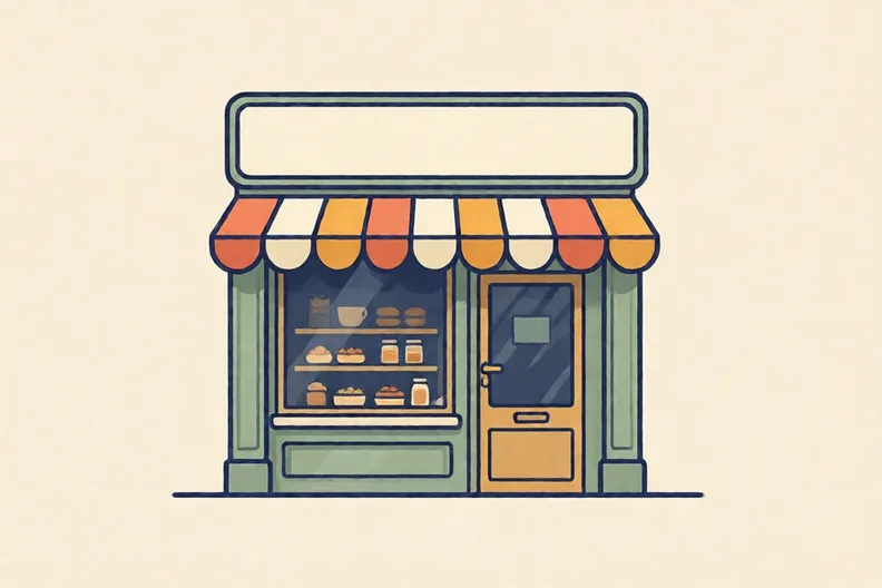
A plain empty shop sign above a bakery door on a sunny street
Kit says: “The shape of a letter does not change how a word feels, so letters are only for reading.”
  1. 1.

    Why is Kit wrong? Write one reason.

E Think deeper4 min

Look at the blank labels on the table. Choose one thing, then draw letters for its label in your sketchbook.
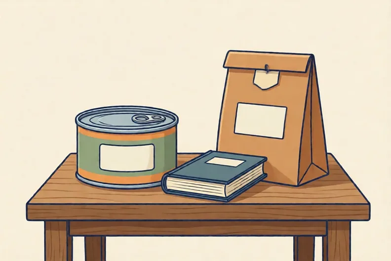
A food tin, a paperback book and a paper bag on a wooden table
  1. 1.

    Choose one thing on the table. In your sketchbook, draw one letter for its label in a warm, friendly style and one in a cold, serious style. Write one line about each:

How did it feel?

I can do it Nearly Not yet
StudyDen · Year 5 · Art & design · Lettering: graphic designAnswers are on the grown-up page

For the grown-up

The Art of Letters · 2 minutes to read

Answers, and what a wrong one tells you

A

1. orange

2. tone

3. triangle

B

1. weak contrast If your child says strong, ask: could you read this sign from across the road? Yellow on white is pale and hard to see, so the contrast is weak.

C

1. strong contrast If your child says weak, ask which colour is darker. Black on yellow has a big gap in tone, so the letters stand out.

2. weak contrast If your child says strong, point to the two colours. Pink and white are both light, so the letters blend in.

3. strong contrast

4. weak contrast If your child says strong, ask: which pair is closer in tone, grey on white or black on yellow? Grey on white is closer, so it is weak.

D

1. Look for: A reason that the shape or style of letters changes how a word feels, such as curly script feeling fancy or spiky type feeling dangerous. If your child only says letters are for reading, point to the blank sign. A designer could fill it in many styles, and each style would feel different.

E

1. Look for: Two letter drawings in different styles, with a line each that names a feeling, for example round soft curves for warm, and sharp straight strokes for cold. If your child only copies a letter, ask what changes the feeling. Round, curly shapes feel friendly; sharp, plain shapes feel serious.

Words to use

Say“What is different about these two letters? Which one would you trust more on a sign, and why?”
Instead of“Letters are just for reading, so the style does not matter.”

After the sheet

Look at a tin, a book and a box at home. Which letters look bold, and which look thin? Say one word for the feeling each one gives you.

Tick what your child got right in StudyDen. Anything missed comes back in a later Look back box, so there's no need to redo the sheet.

The rest of this unit

5 more sheets come with a StudyDen plan, in teaching order:

  1. Words in a Shape(with a plan)
  2. Thick and thin strokes(with a plan)
  3. Building letters from shapes(with a plan)
  4. Design an expressive letter(with a plan)
  5. Expressive word designs(with a plan)

Every Year 5 art worksheet

The worksheets plan opens a printable sheet for every lesson in Years 1 to 6, each with its answers on a separate page for you. It costs £6.99 a month or £59 a year for the whole family, with no free trial.

The full StudyDen plan adds the lessons themselves, marked as your child works, with the worksheets included. It is 7 days free, then £29.99 a month.

Both start with a free account; you choose the plan when you sign up.